Anastasiya
Kamarova
Faculty of Interior Design
first-cycle, 2nd year
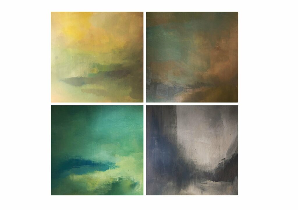
Seasons
See the work
Details of the project
- Title of work
- Seasons
- Studio
- 2nd Sculpture and Drawing Studio
- Head of the studio
- prof. uczelni Paweł Michalak; dr hab. Jarosław Radel
- Technique
- acrylic on canvas
- Dimensions
- 4x40x40cm
- Description
Concrete Siberia
See the work
Details of the project
- Title of work
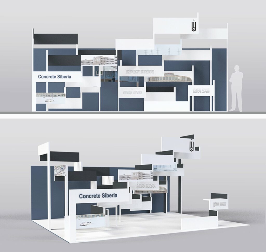
- Concrete Siberia
- Studio
- Exhibition Planning and Visual Communication
- Head of the studio
- dr Adam Orlewicz; as. mgr Kamil Kowalski
- Technique
- 3d visualisation
- Dimensions
- Description
- The exhibition is dedicated to the book Concrete Siberia, published by Polish publishing house Zupagrafika in 2020. The shape and colours of the exhibition result from the most recognisable features of Brutalist architecture: hard and raw geometrical shapes, the expression of structural elements.
Symbols in paintings
See the work
Details of the project
- Title of work
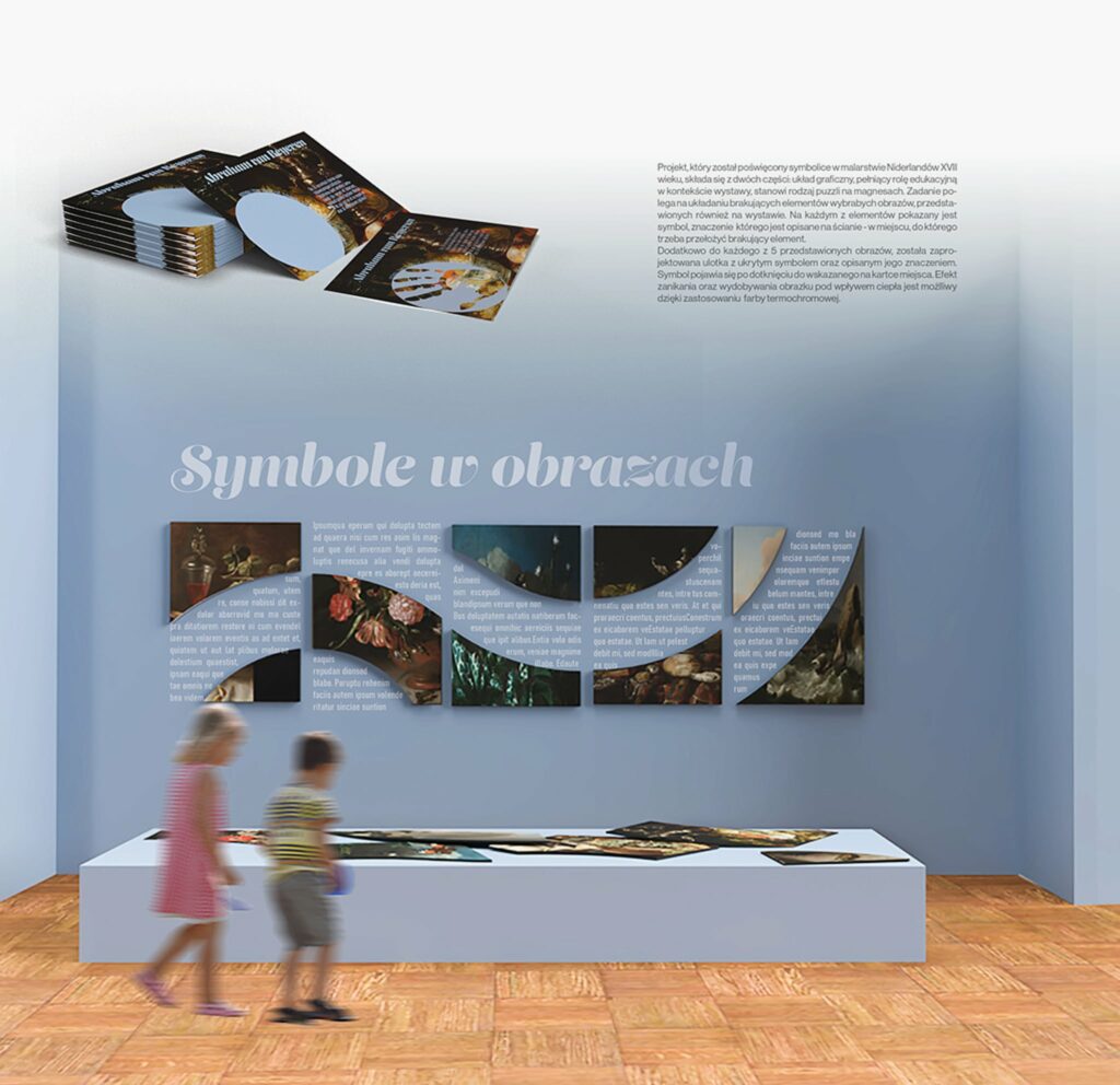
- Symbols in paintings
- Studio
- Exhibition Planning and Visual Communication
- Head of the studio
- dr Adam Orlewicz; as. mgr Kamil Kowalski
- Technique
- 3d visualisation
- Dimensions
- Description
- The project is dedicated to the use of symbols in 17th-century Dutch paintings and consists of two parts: the layout, which plays an educational role in the context of the exhibition, is a kind of magnetic jigsaw puzzle. The task is to arrange the missing elements of selected paintings, which are also shown at the exhibition. On each of the elements there is a symbol, which meaning is described on the wall – in the spot where the missing element must be placed. In addition, for each of the five presented paintings a brochure with a hidden symbol and a description of its meaning was designed. The symbol appears after the point indicated on the card is touched. The effect of vanishing and appearing of the image under the influence of heat is possible thanks to the use of thermochrome paint.


